android Material Theme
For Xamarin.Android and Android Studio
Android Material Theme is a user interface style that determines the look and feel of UI views and activities starting with Android 5.0 (Lollipop) and above. The Android Material Theme is built into Android 5.0, so it is used by the system UI as well as by applications. Android Material Theme is not a "theme" in the sense of a system-wide appearance option that a user can dynamically choose from a settings menu. Rather, Android Material Theme can be thought of as a set of related built-in base styles that you can use to customize the look and feel of your app.
Android provides three default Material Theme flavours:
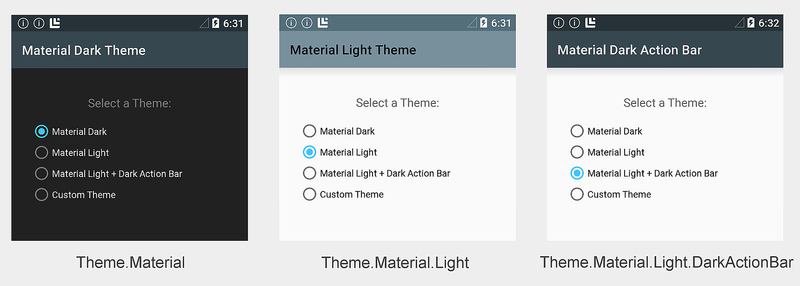
Some examples of these Android Material Theme flavors are displayed in Image:
The following example configures the application MyDemoApp to use the light theme:
The XML Code.
Alternately, you can set the application
The C# Code
When the application theme is set to
The C# Code
Other activities in this app will use the default
Android Material Theme exposes the following layout attributes for customization:
These screen areas are labeled in the following diagram:
By default,
The XML Code

Note that Resources/values-v21 is specific to Android 5.0 – older versions of Android will not read files in this folder.
Add a
The XML Code.
In this example, MyCustomTheme borrows colors from
The XML Code
For Xamarin.Android and Android Studio
Android Material Theme is a user interface style that determines the look and feel of UI views and activities starting with Android 5.0 (Lollipop) and above. The Android Material Theme is built into Android 5.0, so it is used by the system UI as well as by applications. Android Material Theme is not a "theme" in the sense of a system-wide appearance option that a user can dynamically choose from a settings menu. Rather, Android Material Theme can be thought of as a set of related built-in base styles that you can use to customize the look and feel of your app.
Android provides three default Material Theme flavours:
Theme.Material:- The Dark version of Material Theme:. this is the default flavour in Android 5.0.Theme.Material.Light:- The Light version of Material Theme.Theme.Material.Light.DarkActionBar:-The light version of Material Theme with a Dark Action Bar.
Some examples of these Android Material Theme flavors are displayed in Image:
Requirements Of Android Material Theme.
The following is required to use the new Android 5.0 Material Theme features in Xamarin and Andoird Studio based apps:- Xamarin.Android – Xamarin.Android 4.20 or later must be installed and configured with either Visual Studio or Visual Studio for Mac and Android Studio.
- Android SDK – Android 5.0 (API 21) or later must be installed via the Android SDK Manager.
- Java JDK 1.8 – JDK 1.7 can be used if you are specifically targetting API level 23 and earlier. JDK 1.8 is available from Oracle.
The Theming an Application
For configure an entire application to use a Material Theme flavor, set theandroid:theme attribute of the application node in AndroidManifest.xml to one of the following:@android:style/Theme.Material– Dark theme.@android:style/Theme.Material.Light– Light theme.@android:style/Theme.Material.Light.DarkActionBar– Light theme with dark action bar.
The following example configures the application MyDemoApp to use the light theme:
The XML Code.
<application android:label="MyApp"
             android:theme="@android:style/Theme.Material.Light">
</application>
Alternately, you can set the application
Theme attribute in AssemblyInfo.cs (or Properties.cs). For example:The C# Code
[assembly: Application(Theme="@android:style/Theme.Material.Light")]When the application theme is set to
@android:style/Theme.Material.Light, every activity in MyApp will be displayed using Theme.Material.Light.The Theming an Activity
To theme an activity, you add a
Theme setting to the [Activity] attribute above your activity declaration and assign Theme to the Material Theme flavor that you want to use. The following example themes an activity with Theme.Material.Light:The C# Code
[Activity(Theme = "@android:style/Theme.Material.Light",
          Label = "MyApp", MainLauncher = true, Icon = "@drawable/icon")]
Other activities in this app will use the default
Theme.Material dark color scheme (or, if configured, the application theme setting).Using The Custom Themes
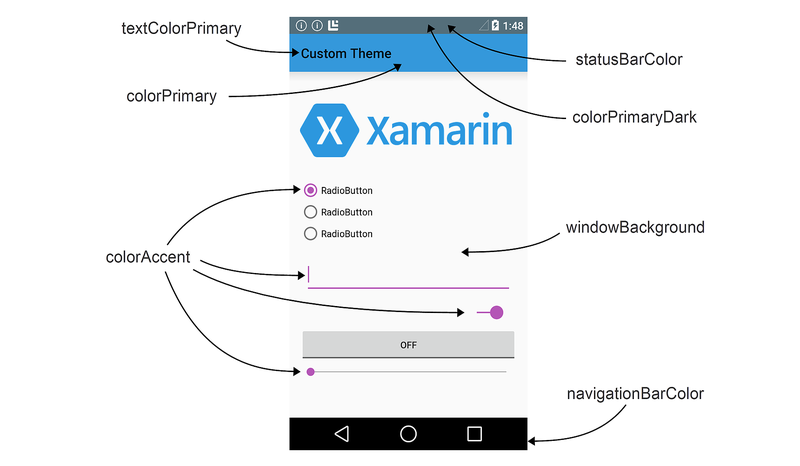
You can enhance your brand by creating a custom theme that styles your app with your brand’s colors. To create a custom theme, you define a new style that derives from a built-in Material Theme flavor, overriding the colour attributes that you want to change. For example, you can define a custom theme that derives fromTheme.Material.Light.DarkActionBar and changes the screen background color to beige instead of white.Android Material Theme exposes the following layout attributes for customization:
colorPrimary– The color of the app bar.
colorPrimaryDark– The color of the status bar and contextual app bars; this is normally a dark version ofcolorPrimary.colorAccent– The color of UI controls such as check boxes, radio buttons, and edit text boxes.
windowBackground– The color of the screen background.
textColorPrimary– The color of UI text in the app bar.
statusBarColor– The color of the status bar.
navigationBarColor– The color of the navigation bar.
These screen areas are labeled in the following diagram:
By default,
statusBarColor is set to the value of colorPrimaryDark. You can set statusBarColor to a solid color, or you can set it to @android:color/transparent to make the status bar transparent. The navigation bar can also be made transparent by setting navigationBarColor to @android:color/transparent.Creating a Custom App Theme
You can create a custom app theme by creating and modifying files in the Resources folder of your app project. To style your app with a custom theme, use the following steps:- Create a colors.xml file in Resources/values — you use this file to define your custom theme colors. For example, you can paste the following code into colors.xml to help you get started:
The XML Code
<?xml version="1.0" encoding="UTF-8" ?>
<resources>
    <color name="my_blue">#3498DB</color>
    <color name="my_green">#77D065</color>
    <color name="my_purple">#B455B6</color>
    <color name="my_gray">#738182</color>
</resources>- Modify this example file to define the names and color codes for color resources that you will use in your custom theme.
- Create a Resources/values-v21 folder. In this folder, create a styles.xml file:
Note that Resources/values-v21 is specific to Android 5.0 – older versions of Android will not read files in this folder.
Add a
resources node to styles.xml and define a style node with the name of your custom theme. For example, here is a styles.xml file that defines MyCustomTheme (derived from the built-in Theme.Material.Light theme style):The XML Code.
<?xml version="1.0" encoding="UTF-8" ?>
<resources>
    <!-- Inherit from the light Material Theme -->
    <style name="MyCustomTheme" parent="android:Theme.Material.Light">
        <!-- Customizations go here -->
    </style>
</resources>
At this point, an app that uses MyCustomTheme will display the
stock Theme.Material.Light theme without customizations: 
- Add color customizations to styles.xml by defining the colors of layout attributes that you want to change. For example, to change the app bar color to
my_blueand change the color of UI controls tomy_purple, add color overrides to styles.xml that refer to color resources configured in colors.xml:
<?xml version="1.0" encoding="UTF-8" ?>
<resources>
    <!-- Inherit from the light Material Theme -->
    <style name="MyCustomTheme" parent="android:Theme.Material.Light">
        <!-- Override the app bar color -->
        <item name="android:colorPrimary">@color/my_blue</item>
        <!-- Override the color of UI controls -->
        <item name="android:colorAccent">@color/my_purple</item>
    </style>
</resources>
With these changes in place, an app that uses MyCustomTheme will display
an app bar color in my_blue and UI controls in my_purple, but use the
Theme.Material.Light color scheme everywhere else:
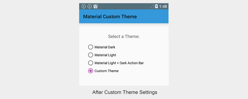
In this example, MyCustomTheme borrows colors from
Theme.Material.Light for the background color, status bar, and text colors, but it changes the color of the app bar to my_blue and sets the color of the radio button to my_purple.Creating a Custom View Style
Android 5.0 also makes it possible for you to style an individual view. After you create colors.xml and styles.xml (as described in the previous section), you can add a view style to styles.xml. To style an individual view, use the following steps:
- Edit Resources/values-v21/styles.xml and add a
stylenode with the name of your custom view style. Set the custom color attributes for your view within thisstylenode. For example, to create a custom CardView style that has more rounded corners and usesmy_blueas the card background color, add astylenode to styles.xml (inside theresourcesnode) and configure the background color and corner radius:
The XML Code
<!-- Theme an individual view: -->
<style name="CardView.MyBlue">

    <!-- Change the background color to Xamarin blue: -->
    <item name="cardBackgroundColor">@color/my_blue</item>

    <!-- Make the corners very round: -->
    <item name="cardCornerRadius">18dp</item>
</style>
In your layout, set the
style attribute for that view to match the custom style name that you chose in the previous step. For example:
The XML Code
<android.support.v7.widget.CardView
    style="@style/CardView.MyBlue"
    android:layout_width="200dp"
    android:layout_height="100dp"
android:layout_gravity="center_horizontal">
In your layout, set the
style attribute for that view to match the custom style name that you chose in the previous step. For example:
The XML Code
<android.support.v7.widget.CardView
style="@style/CardView.MyBlue"
android:layout_width="200dp"
android:layout_height="100dp"
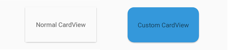
android:layout_gravity="center_horizontal"> The following screenshot provides an example of the default
CardView (shown on the left) as compared to a CardView that
has been styled with the custom CardView.MyBlue theme (shown
on the right):
CardView is displayed with the background color my_blue and an 18dp corner radius.
Compatibility
To style your app so that it uses Material Theme on Android 5.0 but automatically reverts to a downward-compatible style on older Android versions, use the following steps:- Define a custom theme in Resources/values-v21/styles.xml that derives from a Material Theme style. For example:
<resources>
    <style name="MyCustomTheme" parent="android:Theme.Material.Light">
        <!-- Your customizations go here -->
    </style>
</resources>
Define a custom theme in Resources/values/styles.xml that derives
from an older theme, but uses the same theme name as above. For example:
The XML Code
<resources>
    <style name="MyCustomTheme" parent="android:Theme.Holo.Light">
        <!-- Your customizations go here -->
    </style>
</resources>
In AndroidManifest.xml, configure your app with the custom theme name.
For example:
The XML Code
<application android:label="MyApp"
             android:theme="@style/MyCustomTheme">
</application>
Alternately, you can style a specific activity using your custom theme:
The C# Code
[Activity(Label = "MyActivity", Theme = "@style/MyCustomTheme")]
If your theme uses colors defined in a colors.xml file, be sure to place this file in Resources/values (rather than Resources/values-v21) so that both versions of your custom theme can access your color definitions.
When your app runs on an Android 5.0 device, it will use the theme definition specified in Resources/values-v21/styles.xml. When this app runs on older Android devices, it will automatically fall back to the theme definition specified in Resources/values/styles.xml.
No comments:
Post a Comment